Surbhi Bhatia

Thirty charts in thirty days

Notes from the #30DayChartChallenge and the process of making a chart every day of the month

Four years ago, I spent a year completing the month long #30DayMapChallenge run by Topi Tjukanov. It was a year spent learning unfamiliar tools. I borrowed from open codebases, took data detours, met many dead ends before finding a sense of direction on every map. By the end of it, I had become better at mapping.

A lot has changed since then. It's a strange new world where making is easier than ever. Data is abundant. Agents who will write code for you for cheap are abundant. This abundance drew me to sign up for the #30DayChartChallenge by Dominic Royé and Cédric Scherer this year.

The challenge gave me a great excuse thirty great excuses to chase small curiosities. I completed it on time with claude as my collaborator. Often, I'd make a rough chart by hand, or on a familiar tool like flourish or datawrapper, or in R, and then ask claude to translate it using D3.js.

I found myself in four roles over the course of the challenge. A forager out in the wild to hunt for data; an athlete faithful to one more rep, one more lap; a tailor custom-stitching for the right fit; and a traffic controller guiding the reader's attention.

Here are all thirty charts, and below is a glimpse of how each role showed up in the work:

Week 1: Comparisons
Week 2: Distributions
Week 3: Relationships
Week 4: Time Series
Week 5: Uncertainties
Day 1
Day 01 Part-to-Whole
Day 02 Pictogram
Day 3
Day 03 Mosaic
Day 04 Slope
Day 5
Day 05 Experimental
Day 6
Day 06 Reporters Without Borders
Day 7
Day 07 Multiscale
Day 8
Day 08 Circular
Day 9
Day 09 Wealth
Day 10
Day 10 Pop Culture
Day 11
Day 11 Physical
Day 12
Day 12 Flowing Data
Day 13
Day 13 Ecosystems
Day 14
Day 14 Trade
Day 15
Day 15 Correlation
Day 16
Day 16 Causation
Day 17
Day 17 Remake
Day 18
Day 18 UNICEF
Day 19
Day 19 Evolution
Day 20
Day 20 Global Change
Day 21
Day 21 Historical
Day 22
Day 22 New Tool
Day 23
Day 23 Seasons
Day 24
Day 24 South China Morning Post
Day 25
Day 25 Space
Day 26
Day 26 Trend
Day 27 Animation
Day 28
Day 28 Modeling
Day 29
Day 29 Monochrome
Day 30
Day 30 Global Health Data Exchange

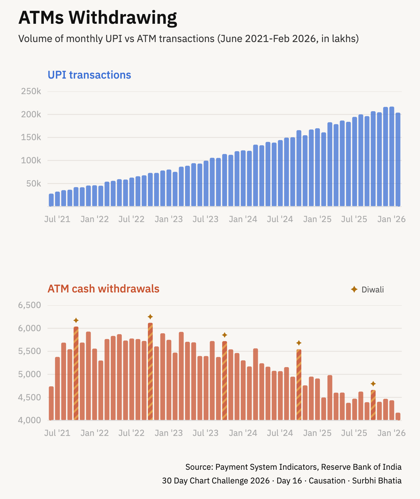
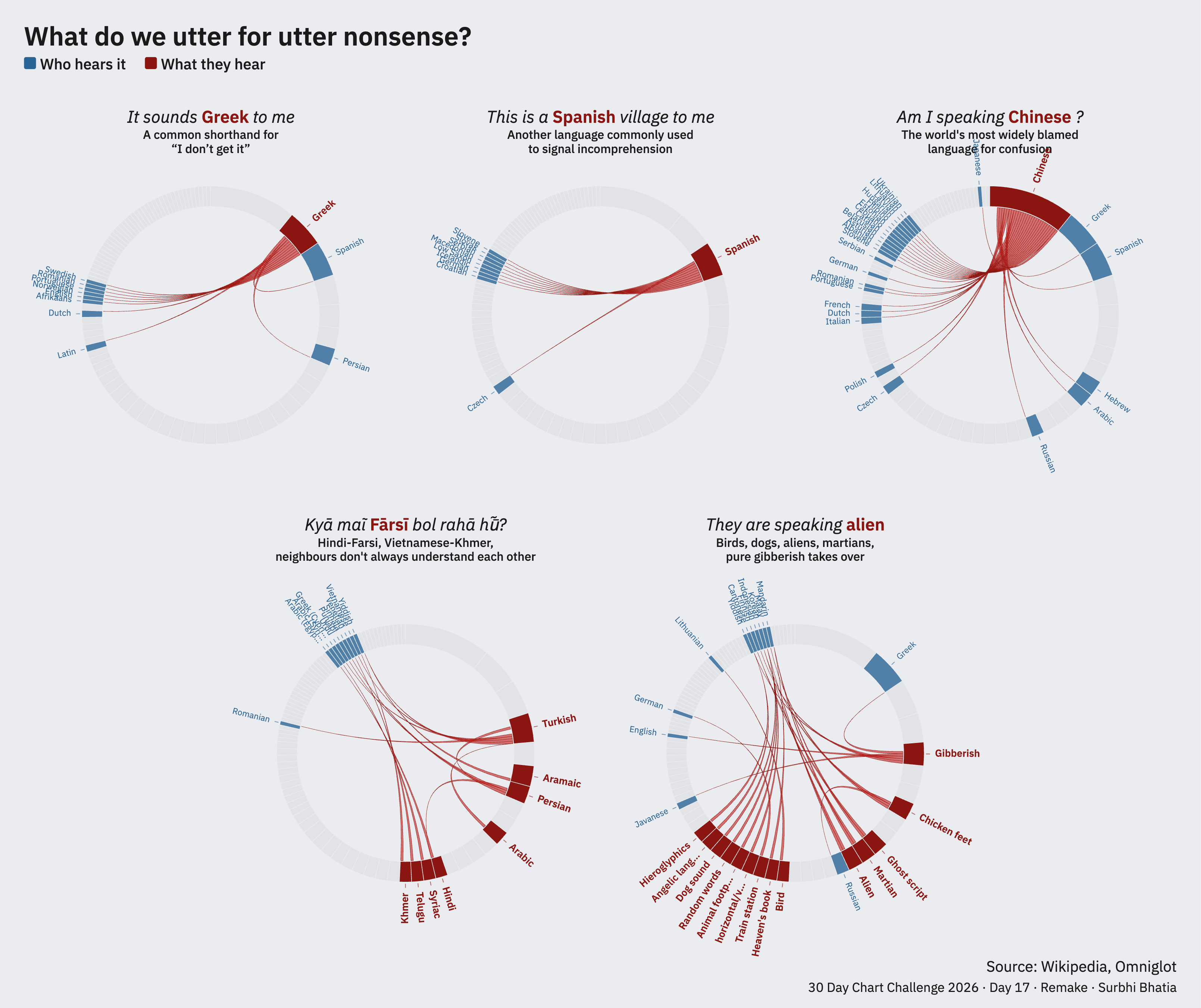
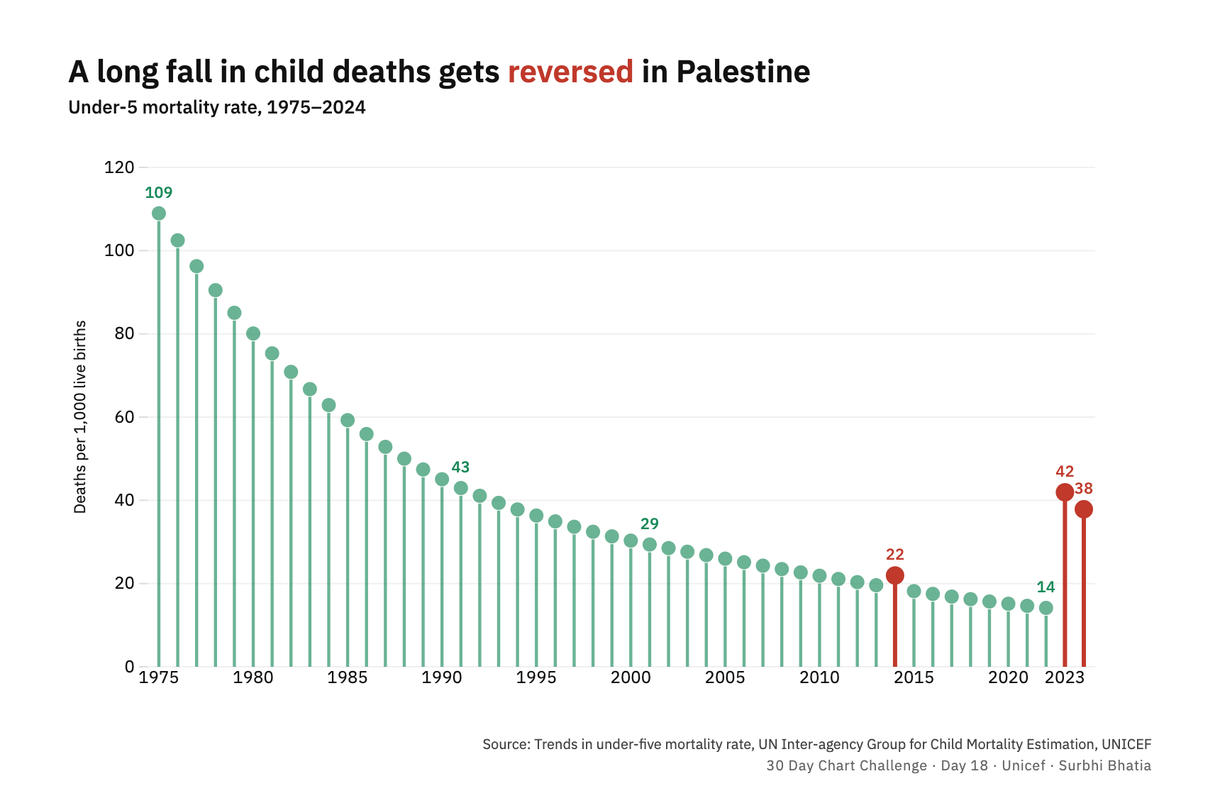
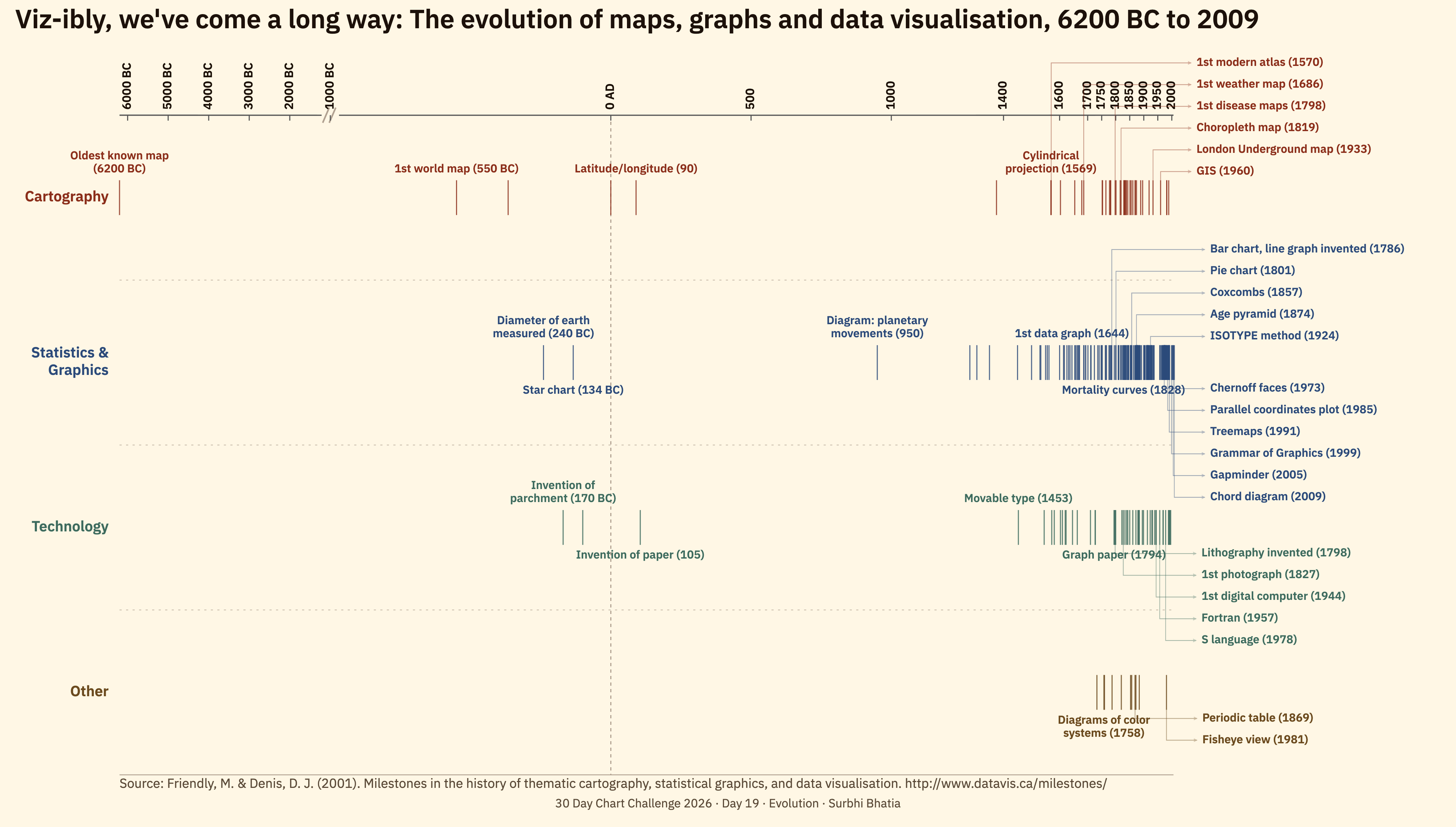
If you're wondering where to begin, here's how I approached it:

A forager out in the wild to hunt for data

There are at least two ways to approach making a chart where all you have is a one-word prompt. You can either start with a dataset, and find something to plot, like how #TidyTuesday works. Or start with a question, and go looking for the data to answer it.

Early in my career I was the data-first type. I used to think if there's no data, there's no story. This has changed with years of experience as a data journalist. Without realising it, I had built a personal directory of sources: where to look, what to trust, how to do back-of-the-envelope math to get from data to insight.

Starting with a question came naturally to me during this challenge. Between open portals, APIs, scraping, easy OCRs and simple downloads, access to data was the easy part. The data was almost always out there if I could frame what I was looking for. The thirty questions I pursued are in an open workbook towards the end of this page.

An athlete faithful to one more rep, one more lap

Every day, I was back at the same start line, to run the same sequence:

Question Data Analysis Insight Chart Type Tool Design Annotation

Like any new workout or meditation routine, the first few days are rough, but slowly the mornings stop feeling hard. It built stamina, and gave me the appetite to repeat the entire process end to end, day after day.

But this is not the only way. For some, the entry point is data:

Data Question Tool Analysis Insight Chart Type Design Annotation

For others, it could be the tool. People are loyal to the tools they spent years learning. The Tableau community sticks by it. Datawrapper devotees stick to it. There is wisdom in working within the grammar of the tools you know best:

Tool Data Analysis Chart Insight Annotation

The sequence looks neat on paper, but in practice it rarely holds a linear shape. For example, some days the prompt was a chart type I worked backwards from.

A tailor custom-stitching for the right fit

It is very tempting, once you have some data, to want more data: another decade, another city, another source, another scrape.

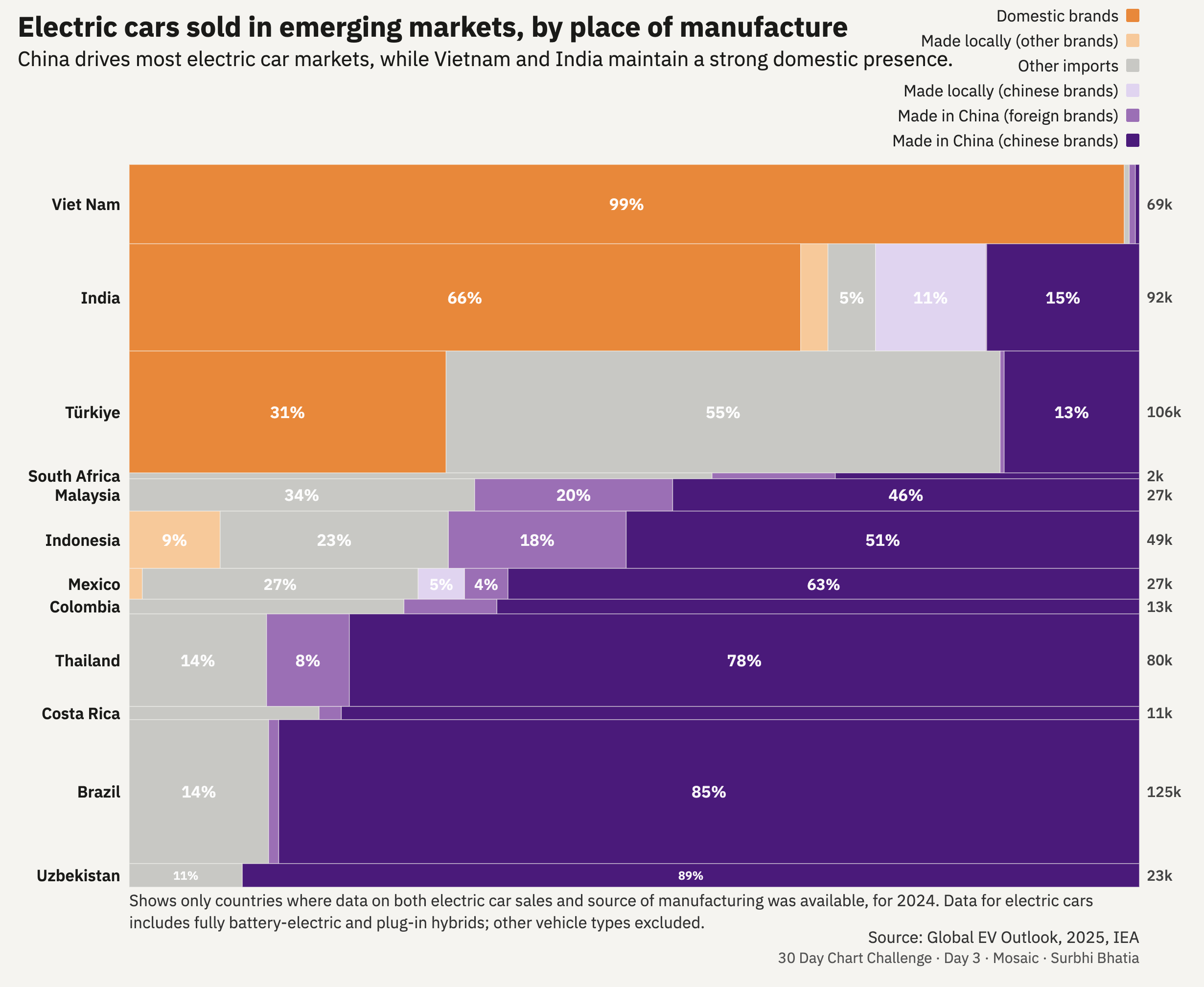
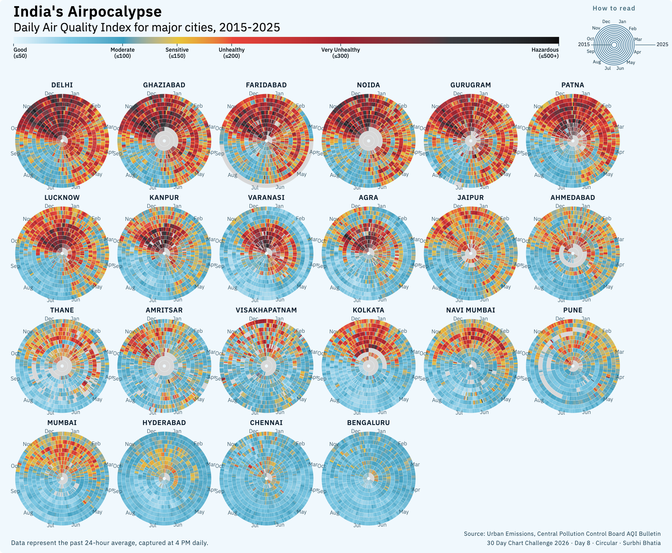
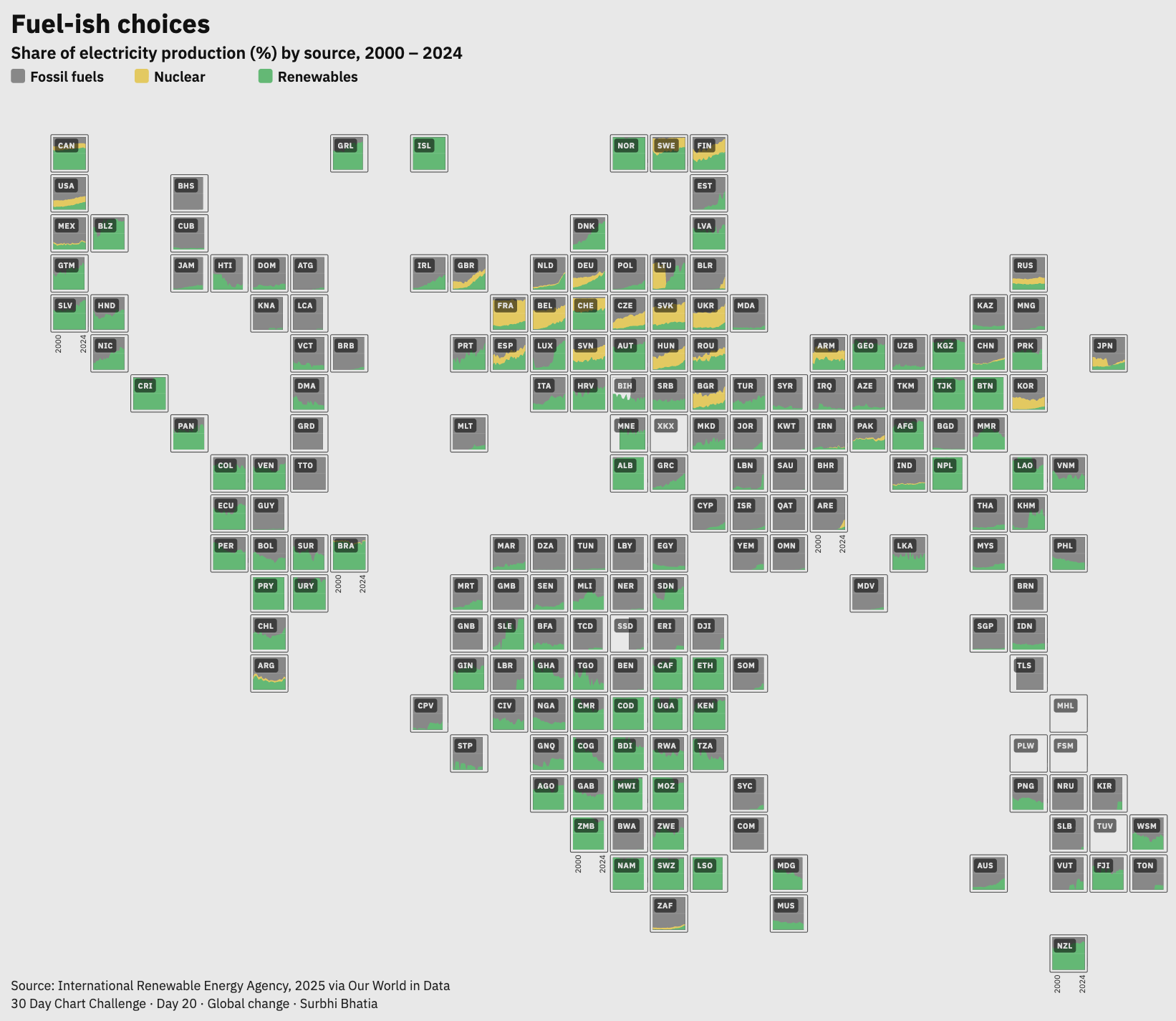
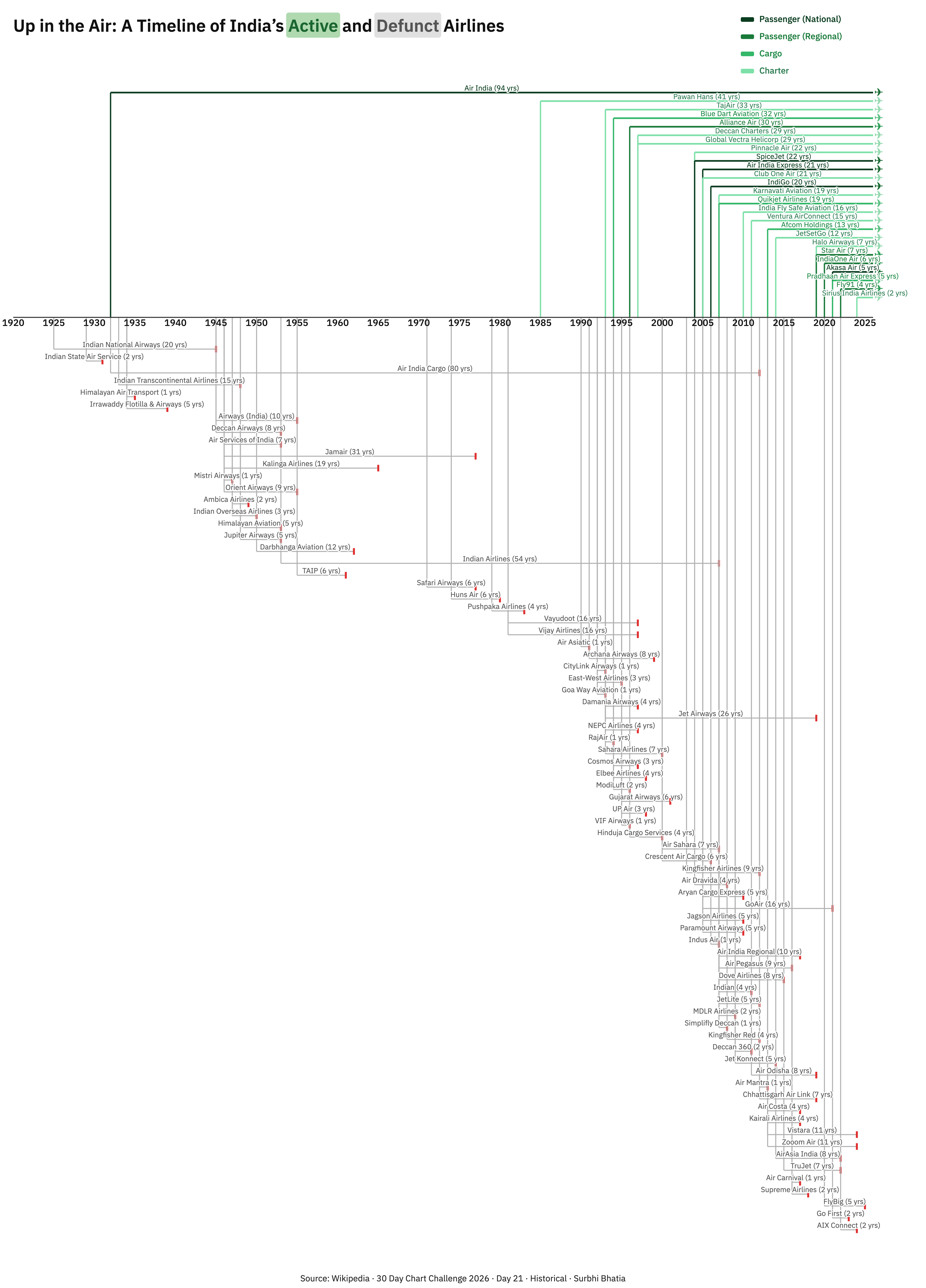
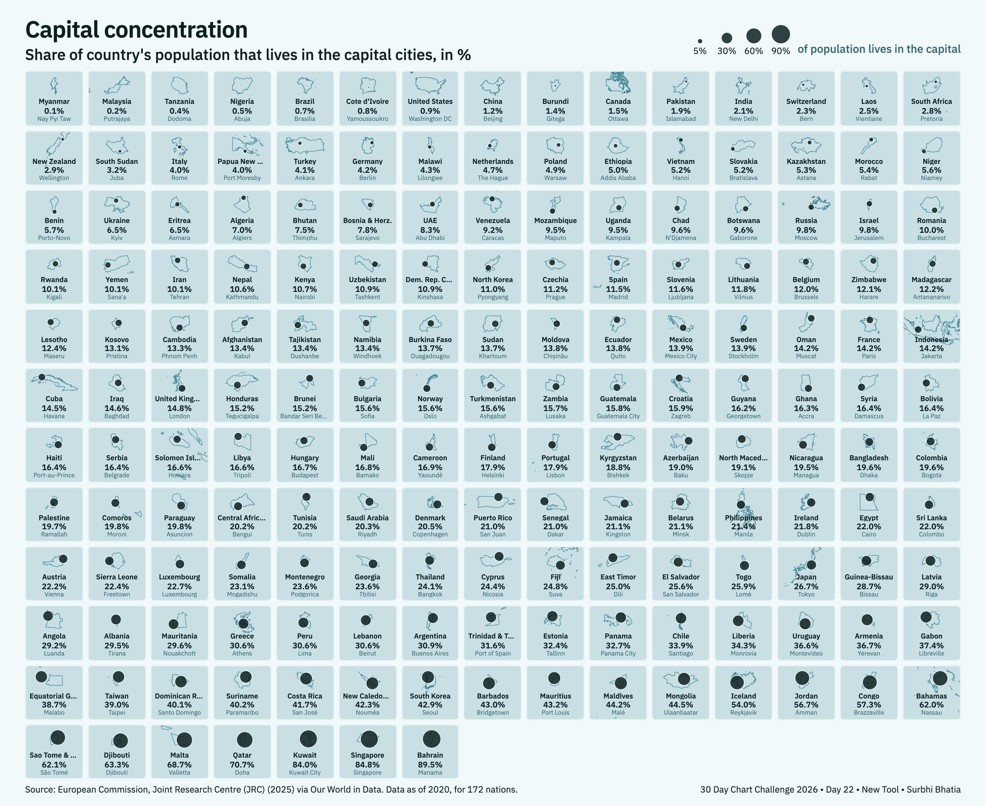
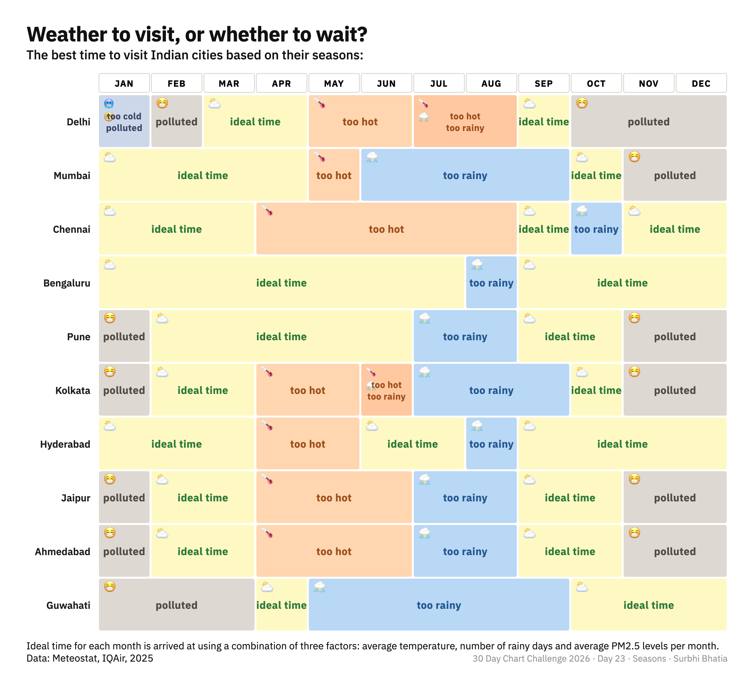
A daily challenge teaches you to work with the fabric on the table. You can cut the same fabric to make a handkerchief, a scarf, or join many pieces to sew a skirt. In some instances I chose to stitch just 10 data points even if there were a lot more available. In others, I chose to waste nothing and made a chart with all 76k data points. The challenge was less about the amount of fabric and more about the cut.

Nothing is wasted when you tailor this way. Any cloth left behind comes together in another form. A dataset kept aside fit a later prompt. A chart type abandoned got thrifted into a second life. The offcuts came together as patchwork all the time.

A few well-chosen rules can carry the project a long way. Shri Khalpada locked in the fonts, formats, colours, tools, to reduce the number of micro-decisions. Georgios Karamanis defined the data universe entirely around Uppsala's transport data and worked within those bounds to chisel out the charts. Constraints make their work stand out in the same way as a fence that helps separate a garden from a field.

A traffic controller guiding the reader's attention

An editor I worked with used to say one chart is not the story. But they also said that if a chart is screenshotted and shared as a standalone image on WhatsApp, it should be able to explain the story. So I was very conscious that every chart had an answer to the one and only question of life: "What's the point???"

A lot of my time was spent on titles, annotations, stripping back anything that didn't earn its place on the canvas. It was like traffic-managing attention, hierarchy, and inference. The green signals have to be very clear for a reader to reach the point.

Some charts are demanding by design, like a Marimekko chart, which asks for patience and a degree of chart literacy. A chart can demand effort, but the reader should never feel punished for trying to engage.

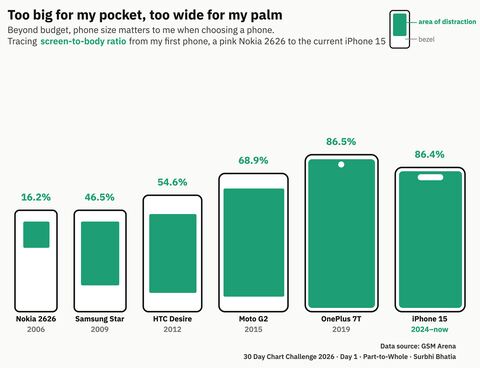
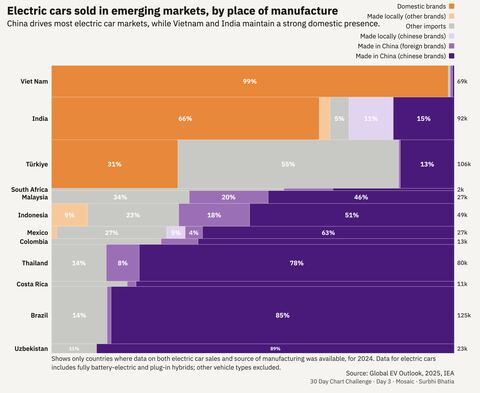
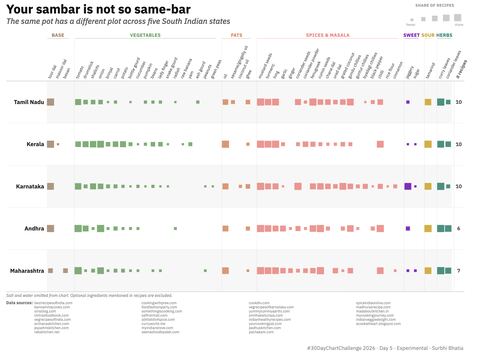
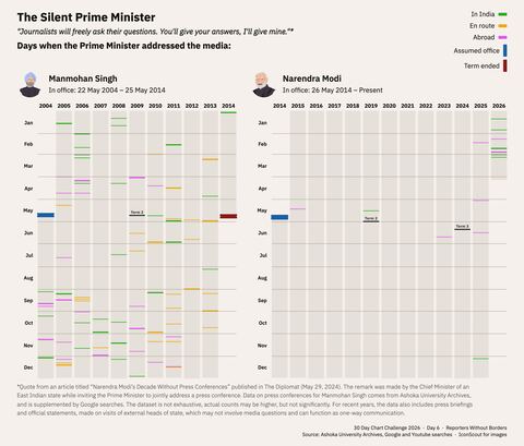
And now, on to the charts.

Day 01 | Comparisons

Part-to-Whole

Day 1 — Part-to-Whole

The chart originally made for this prompt, on protein bars, moved to Day 29. It sat in my pile of discarded charts to be refurbished in monochrome, when the idea of phone screens struck me.

For a while, I've been wanting to do a project on how phones no longer fit our hands. I could have got the dimensions of every phone model of a certain brand from GSMArena, and show change over time. But with little time left after this last-minute change, I turned to personal data to quickly make this. Personal can be universal, I guess.

Day 02 | Comparisons

Pictogram

I don't know how to draw digitally. But I have a rough sense of embedding SVGs in code after cleaning them up in Figma. These tiny Warli-style figures: girls, boys, middle-aged, old, Indian people, are derived from Anu's Artastic Warli figure tutorial. I've been calling it "Our Warli in Data."

Day 03 | Comparisons

Mosaic

Day 3 — Mosaic

A last-minute chart again. What I originally tried for this prompt became the seasons chart on Day 23. Realised halfway through it that the bar widths were all the same, which makes it not a mosaic. Found IEA data last minute that fit the format beautifully.

Day 04 | Comparisons

Slope

Slope charts can be slippery because you are comparing positions and angles at the same time. For this one, I updated the data from an old story on bollywood remakes, and a chart that inspired the story.

Was it tempting to save this for a meta-day release for Day 17 prompt: remake? Yes. But did I have no other idea for this and plenty of chart remakes for that prompt? Yes. You know what they say about a bird in hand.

Day 05 | Comparisons

Experimental

Day 5 — Experimental

Food recipes are probably humanity's greatest experiment, and few dishes invite stronger opinions than sambar. I love a nuanced culinary war! This chart is inspired by one of my all-time favourite charts by David Waldron.

Day 06 | Comparisons

Reporters Without Borders

Day 6 — Reporters Without Borders

The labels and tables have turned.

Day 07 | Distributions

Multiscale

Day 7 — Multiscale

From my early career days, when I used to make a lot of structural break charts in R on financial markets. Glad to have learnt some colour theory in life!

Day 08 | Distributions

Circular

Day 8 — Circular

This is less of a comparison between cities and more a ranking of how differently we're all doomed.

Day 09 | Distributions

Wealth

Day 9 — Wealth

I came across this Peterson Institute of International Economics paper, The origins of the superrich a few years ago, and it changed how I looked at billionaires.

Day 10 | Distributions

Pop Culture

Day 10 — Pop Culture

We all know watching Dhurandhar is a four-day commitment, right? For this, I already had a list of top 10 movies per year, all I had to do was scrape run-time from IMDb. I don't think the numbers are dramatically spiraling upwards, but the data says what the data says.

Day 11 | Distributions

Physical

Day 11 — Physical

There's something nostalgic about charting CDs. This one came together in about 20 minutes. A lone US-only chart in the series.

Day 12 | Distributions

Flowing Data

Day 12 — Flowing Data

FlowingData had the template, my friends at Diagram Chasing had the data. I just had to assemble the pieces together.

Day 13 | Relationships

Ecosystems

Day 13 — Ecosystems

This idea traces back to a talk by Leewardists organised by Revisual Labs, but also to a very personal irritation: the near absence of last-mile connectivity around metro stations in Indian cities.

In cities like New York City or Tokyo, you can step into the subway literally from below your apartment building. It's possible to find that in older, denser parts of Indian cities. But in the suburbs, gated enclaves swallow up land parcels and metro lines end up shadowing ring roads.

Day 14 | Relationships

Trade

Day 14 — Trade

I spent a while wandering through The Atlas of Economic Complexity hoping to start with data and arrive at an insight. A few hours later, abandoned it fully to answer a simple question: what do Indian states export the most? Within it, simplified it further to just one commodity: rice.

Day 15 | Relationships

Correlation

Day 15 — Correlation

The Indian Constitution, with 146,385 words, is the longest in the world. But does that correlate with better rule of law? This chart is a refurbished version of an early days piece: The Long and Winding Constitution at ThinkPragati.

Day 16 | Relationships

Causation

Day 16 — Causation

When's the last time you made an ATM run?

Day 17 | Relationships

Remake

Day 17 — Remake

If Greek sounds like nonsense to English speakers, what sounds like nonsense to the Greek? (Answer: Chinese.) Remaking an old chart from back when I didn't realise messing with reading direction is a design sin.

Day 18 | Relationships

UNICEF

Day 18 — UNICEF

With hospitals bombed, food and medicines in short supply, and access to essentials collapsing, the war on Palestine has undone decades of progress in child survival.

Day 19 | Time Series

Evolution

Day 19 — Evolution

Tried a chart about the evolution of charts, by Michael Friendly and D.J. Denis. A centuries long attempt to make sense of the world through diagrams, geometry, and better ways to see what numbers are doing.

Day 20 | Time Series

Global Change

Day 20 — Global Change

How do countries power themselves? Over the last two decades, the world's electricity mix has been slowly turning green, but not everywhere.

Day 21 | Time Series

Historical

Day 21 — Historical

India's aviation history is full of ambitious takeoffs and abrupt endings. In my lifetime alone, Indian airlines have appeared, merged, vanished, and rebranded faster than most people can keep track of.

Day 22 | Time Series

New Tool

Day 22 — New Tool

I tried Orange as a tool first to make this. It was fantastic at tracing no-code workflows but less helpful when you want bespoke charts. Here's a chart anyway. Did you know just 0.1% of people in Myanmar live in Naypyidaw, its capital?

Day 23 | Time Series

Seasons

Day 23 — Seasons

A cheat sheet for the best time to visit Indian cities. They are all getting hotter so data may not hold by next year.

Day 24 | Time Series

South China Morning Post

Day 24 — South China Morning Post

इনடఇಅ, a potpourri of languages. Inspired by Alberto Lucas López's "A world of languages".

Day 25 | Uncertainties

Space

Day 25 — Space

A space race between countries to reach the Earth's orbit, and how often the attempts succeed.

Day 26 | Uncertainties

Trend

Day 26 — Trend

Japan's green teas are the trend in cafes around the world. But at home, both consumption and production are falling, while exports rise to match the growing demand abroad.

Day 27 | Uncertainties

Animation

Ship traffic through the Strait of Hormuz comes to a halt and has yet to recover. A prolonged disruption to one of the world's busiest oil routes amid the US war on Iran. So much fun making this on Flourish!

Day 28 | Uncertainties

Modeling

Day 28 — Modeling

None of the three largest emitting nations are on track, or even pledging to meet the 1.5°C climate target of the Paris agreement, projections show.

Day 29 | Uncertainties

Monochrome

Day 29 — Monochrome

The original part-to-whole chart. Spending ~₹100 on a protein bar? Here's unpacking what you're paying for across popular options.

Day 30 | Uncertainties

Global Health Data Exchange

Day 30 — Global Health Data Exchange

India's health risk profile is shifting. Risks from unsafe water, poor sanitation, and undernutrition have declined. New threats such as air pollution and high blood pressure have moved to the top of the list.

I was very happy to see some of the work getting featured in Data Vis Dispatch's April 14 edition and by Flourish.

Data Vis Dispatch, April 14 edition — feature 1
Data Vis Dispatch, April 14 edition — feature 2
Flourish feature

The data for all thirty charts lives in an open workbook, here:

Will I do the challenge again?

Hell, yeah! I love a good charty-party!

foot(er)-note ↑